
All too often people are accused of being boring or timid if they decorate with neutrals. This misunderstood palette is far from bland and drab; it can be timelessly classic, slick and contemporary, calm and soothing or even downright bold.
As with any successful design, a neutral colour scheme requires some basic elements and components and if you keep the following in mind, you can create a stunning space that is definitely NOT boring.
Contrast
Contrast creates depth and visual interest; it forces the eye to stop and start as it moves around a room. Without it, a neutral palette can easily become a colourless ‘blob’. Remember contrast when you’re choosing fabrics, furniture finishes and accessories. A balance of light and dark is the key to just the right amount of contrast without making the room too busy.
Texture
As with contrast, texture is required for visual interest and depth. Paint a wall white and you have a white wall. Install white brick veneer on a wall and, voila, you’ve got a wall with interest and depth. Texture can be incorporated with fabrics, finishes, flooring and artwork.
Architectural Details
Any amount of architectural detail adds character to a room and is a great addition to any room. Oversized baseboards, crown molding, chair rail and raised panels all give a room personality and compliment a neutral palette without taking over.
Bring the Nature in
Make sure to bring nature into your design. Nature’s green breathes life into any space. If you don’t have a green thumb, don’t fret; some of today’s silk plants are so convincing that you may be the only one who knows they’re not real.
Colour
Yes, COLOUR!
Don’t assume that a neutral palette has to lack colour. You can create a neutral design around any hue as long as it’s not deep and vivid. A colour’s intensity is referred to as chroma and any low chroma colour can be the start of a good neutral scheme. Try a pale blue grey or even a purple grey and bring in varying shades of that colour to complete the look.
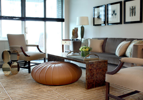
Contrast is evident here in the use of the dark blinds, black picture frames and wood trim on the chairs, while the rug and ottoman provide texture.
Contemporary Living Room design by Chicago Interior Designer Sean Michael Design
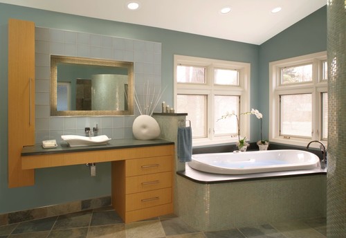
The low chroma blue in this bathroom keeps the mood of a neutral scheme while bringing a bit of colour into the mix.
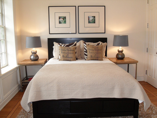
This calming bedroom incorporates contrast with the dark wood bed and black picture frames which provide visual interest and balance to the space. You can also see the use of architectural detail in the door and trim below the window.
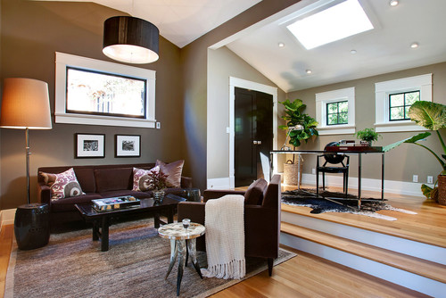
In this neutral scheme, you see how contrast is established with the deep toned brown playing against the white trim. Also note the greenery and the texture in the area rug.
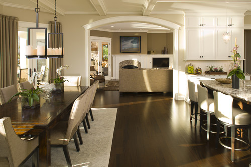
The browns and warm taupe tones of this space make it a true neutral colour palette. It's brought to life through the variety of architectural detail and contrasting elements. They also made sure to bring in hits of green
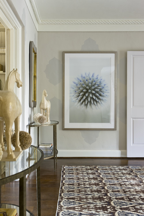
With the light grey walls and white trim of this entryway, texture and visual interest is key. The lack of fabric does not allow for tactile texture so they've provided strong visual texture in the area rug and large print. They've also made sure to provide contrast through the dark finish on the floor.
1 comment:
Pretty interesting post! Thanks it was interesting. http://windowtech.ca
Post a Comment
Thank you for your comment.
I will review and post shortly.